I have chosen several music magazines to look at and analyse in terms of colouring, clothing, settings, size. I have collected music magazines from online from different genres in able to compare and analyse the layout of them as you are going to be able to see in it. However mainly I was focusing on hip-hop genre magazines in able to collect information about it to later on create my own.
Monday, 11 January 2016
Thursday, 10 December 2015
What is gratification, and who were Katz and Bumler
Gratification is a popular approach to understanding the mass communication. Its main aim is to focus on the audience instead of the importance of the message. It assumes that people have the power on their own to be opinion leaders and to interpret media. It also deals with how and why people adopt to specific media to satisfy their own needs. Mainly it analyses the reason why people use particular media rather than the content itself.
This theory has been applied to several platforms of the media. We can find features of gratification in printed adverts, audio , and also online.
Especially internet plays a really important role in our everyday life, because it allows us to be looking for any topics that we like, expand our knowledge about certain things, to educate and to raise argument against those articles that we do not believe or trust in.
These everyday functions are all supported by popular websites such as Wikipedia, YouTube, Facebook .
Bumler and Katz expanded the gratification theory and published their own in 1974, stating that individuals might choose and usecertain texts for different purposes such as,
-Diversion, entertainment- to be able to escape from everyday problems and routine.
-Social wellbeing, personal relationship- which means using the for emotional and phisical interaction, for example making relationships, making friends,
-Personal Identity- finding yourself reflexted from the article, picture, or sound , and learning values and qualities from it
-and surveillance- which means information collecting to be able to have an idea about the happening around your environment
Research task |BBC Worldwide|

This is because BBC’s main objective and motto is “To educate, inform and entertain”. Therefore like other bigger or also smaller media companies they diversify themselves, in able to specialise their focus on one particular target audience group.
This allows them to target a wider range of people, through offering them what they want and what they are interested in, and also it allows them to expand their audience’s knowledge and enjoyments for their favourite BBC programmes through magazines, digital editions, books and live events.
BBC
Magazines' overall performance is up
2.8% period on period and stable year on year*, as a result of several
new launches, strong performances by its specialist brands and the closure of
some poor-performing titles.
http://www.bbc.co.uk/pressoffice/bbcworldwide/worldwidestories/pressreleases/2010/02_february/magazines_abcs.shtml
One of their major publishment Top Gear, which is a TV show, a website and they
also have a magazine for it has a major influence on BBC’s target audience. It
mainly targets male target audience in age of 15-60 which is a really wide
range. It is also interesting to see how they attract such a wide range of
audience, by creating a particular image for themselves, and choosing
specialised topics that interest their target audience.
-easy to read
-looks professional-apealing look
The layout of the magazine looks really professional, it also relates and represents the topic that they are actually dealing with which are cars, the colouring is simple, which is based on white, red and ,black which allows a professional, simple and effective influence on the audience, in any age. Also they like to use extreme colours such as orange and green to create a unique look to the magazine, in certain editions. This allows them to appeal to a younger target audience, and also shows the diversity of the magazine.
BBC Music magazine is a monthly
magazine, that had its first issue appeared in June. Its original owner of this
particular was BBC Worldwide and Warner Music Enterprises.
It had such a massive success it also has an edition in North America which was first published in March 1993. The magazine reflects broadcast output of BBC radio 3, which plays classical music, jazz, world music and the latest trends in classical music of the 21st century
.
The genre of the music shows what target audience they want to appeal to, which is women and men in age of 40+, this is because classical and jazz music is more likely to be liked by this age group
-simple-professional-image focusedsophisticated
The ‘Music” magazine has a different target
audience who they appeal to as I said earlier on, therefore they have to make
sure that they maintain , their professional look, which helps them to keep
their image and reputation at the same time. The most noticeable factor that anyone could see is that
they keep the shape, and colour of their masthead, not like most of the
magazines do, which allows them to be loyal to their image. They like to use
the colour black because it matches with a lot of other colours and also it
creates a professional look, which in this case is really important in able to
appeal to their target audience.
Wednesday, 2 December 2015
Research |IPC Media|
I have chosen to research IPC media, it is a
large UK based media company that holds a lot of different media platforms and
magazines such as: Now, TV Weekly and country life.
IPC uses different platforms that allow them to offer a really good customer service, and also shares the important information through different platforms, therefore the availability for it increases. Their topics and article are published online, through mobile, and tablets and also most importantly through magazines.
They have got an incredibly big target audience with the number 26 million. This number is being divided for 58% women and 42% men, which shows the main target audience is women, which is a key factor in terms of how they design their branding and their image, in able to appeal to their main target audience.
IPC uses different platforms that allow them to offer a really good customer service, and also shares the important information through different platforms, therefore the availability for it increases. Their topics and article are published online, through mobile, and tablets and also most importantly through magazines.
They have got an incredibly big target audience with the number 26 million. This number is being divided for 58% women and 42% men, which shows the main target audience is women, which is a key factor in terms of how they design their branding and their image, in able to appeal to their main target audience.
In the 1800 they were called differently and
their first newspaper called “Filled” has been launched in 1853, also they
already had other newspaper such as: Horse and Hound, Shooting Times, and The Railway
Magazine.
They have a large range of target audience, that is why they diversified to make different magazines with different genres such as, women’s life, home, sports
For example NME a large music magazine of
theirs has been released in 1952 which created a first official UK Chart which
is still active ever since that time.
This is one of the NME magazine’s edition, and we can see Rihanna, a
famous pop singer on the magazine cover. The layout of the cover is really
simple , based on 2-3 colors, which makes the model stand out.
-It impresses the audience with its simplicity
-it
appeals to a younger audience because of the model and the font style
-It
also makes the audience pay attention to the masthead, because of the image
representation.
Here are some other examples from different editions of NME, magazine. As we can see they have changed their image throughout different editions, in able to create an appealing look that is not boring and that specifically appeals to their target audience.
Because of its lay outs, topics, and the celebrities that they are working with, we know that they are appealing to a wide range of target audience in age of 13-30 who like pop music. They probably made this decision, because their magazine is UK’s official chart, and also a massive percentage of people like pop music or at least they are interested what is going on within the pop industry.
The colors and the lay outs they use for their music magazines are really simple, which creates fashionable look. As we can see on the examples above they like to use bold colors such as red, white and black to be able to show contrast and increase attention for certain parts of the magazine
Another
famous magazine that has been published by IPC media is : Inside Soap, which is
a social magazine, to inform and entertain about happenings around UK , celebrities,
and gossips.
It started of as a monthly magazine in October 1992 however by 2003 September they received such a big range of audience they decided to publish their magazine weekly.
This particular magazine is different to the one I have researched earlier on. This is because NME is a music magazine and Inside Soap is a gossip magazine, and also they have different target audiences.
As we can see Inside Soap’s magazine majorly differs from the magazine (NME) that I have chosen earlier on.
It started of as a monthly magazine in October 1992 however by 2003 September they received such a big range of audience they decided to publish their magazine weekly.
This particular magazine is different to the one I have researched earlier on. This is because NME is a music magazine and Inside Soap is a gossip magazine, and also they have different target audiences.
As we can see Inside Soap’s magazine majorly differs from the magazine (NME) that I have chosen earlier on.
As you see the lay out is more complicated, with more explosive colours that
signify different moods, and also it contains a montage of pictures which
demonstrates what the stories about and it appeals to a older target audience
in age of (20-50), people who are really interested in gossips and celebrities’
life.
-montage of pictures
-explosive interesting colour
-power of three
-love and drama
Wednesday, 11 November 2015
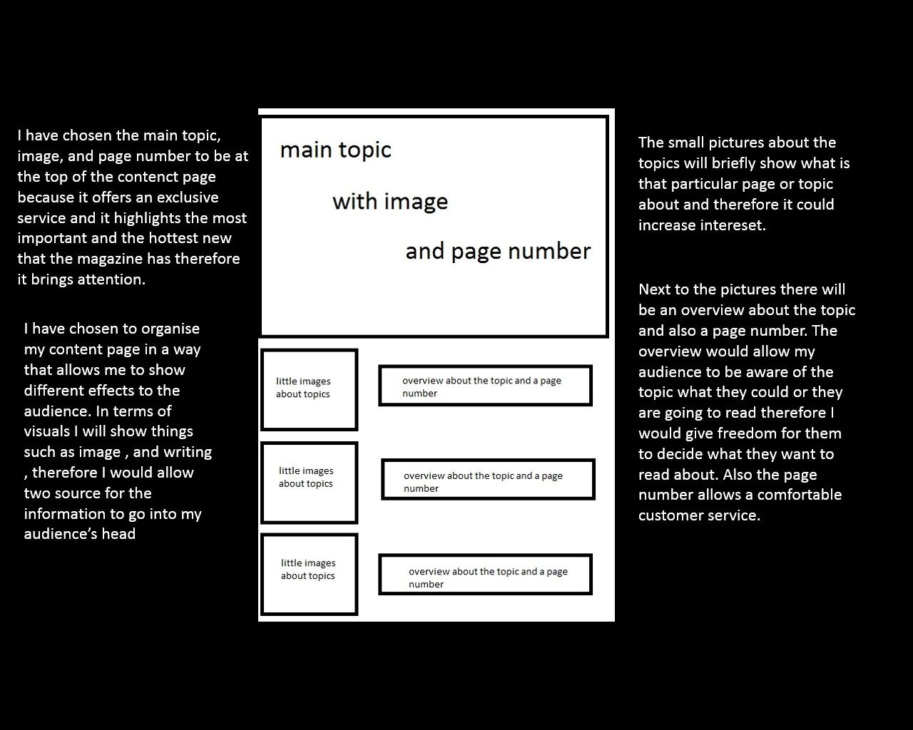
Plan for the cover and the content page
These two following picture which i am uploading are goin to be my plans for my magazine covers and my content page. It shows the way i will organise it and it gives a reason why i have done it
Thursday, 5 November 2015
The masthead of the School magazine cover
Based on my audience's feedback and my opinion, i wanted to create i masthead that looks really professional however also looks modern and appealing, so i mixed some shapes and colours and created the following masthead. The name of the magazine is going to be HD HIGH, this is because this name contains a lot of signifiers and representations. The word "HD" stands for the school's name which is High Down, however also relates to the quality f image "HD" which is the maximum quality you can get therefore it creates a professional representation that our magazine offers something that is a really high quality. The word "HIGH" stands for high school and also have a representation for the name of the school which is as i said earlier on "HIGHDOWN" \
Subscribe to:
Posts (Atom)